Hans Ulrich Obrist: Let’s begin at the beginning: how did art come to you, or how did you come to art?
Barbara Kruger: I didn’t really come to art because, until I was quite a bit older, I wasn’t sure what art was. I only went to art school for about a year and a half; I have no graduate degrees. Being an artist was certainly not in my realm of possibility growing up in Newark, New Jersey. I did think of becoming an illustrator or a commercial artist, but an art world was something I couldn’t even imagine. And art really didn’t come to me either. As I’ve said many times before, when I was first starting up, the so-called art world in New York, in terms of power, was 12 white guys in lower Manhattan; there wasn’t really room for anyone else. Although artists of many genders and many colors did exist, they weren’t part of that hierarchy. It seemed like a forbidden terrain.
HUO: Can you tell us about the artists, architects, and thinkers that influenced you at the beginning?
BK: What had always been of interest to me as a young person, before I was an artist, was the built environment and architecture. I think maybe I had dreams of becoming an architect, but that never happened. I really hadn’t gone to museums much at all. My parents took me to the Museum of Modern Art in New York once when I was young. What I remember most from my visit there was the design department – all the great objects, commodities, architecture, and design solutions. That’s really what I took away from it.
HUO: You once said that ‘Architecture is one of the predominant orderings of social space’, and also that just by ‘entering it, you become part of it’. Were there any specific architectural experiences that inspired you?
BK: Not so much. The interesting thing, in terms of residential architecture, is that my parents never owned property; we never owned a house or an apartment. Sometimes we spent weekends – these dream journeys – going to open houses and fantasizing about what it would be like to live in these properties. I remember all the rooms had velvet ropes at the entrance, so you couldn’t walk into them. It was my experience of not being allowed within the privacy of that residential space. I remember drawing plans for housing developments with differing models of houses as a young girl. It was such an unreal thing for us to live in anything but a three-room apartment in Newark. I saw it as a fantasy projection. One of the interesting things about moving to Los Angeles 32 years ago was that I was very aware of the history of the city’s modernist architecture from 1917 to 1970. The expatriates, the émigrés from Germany and Austria, created such amazing living spaces and built environments.
HUO: So, these drawings of developments are some early unrealized architectural projects of yours?
BK: Yes, but, in truth, when I was able to do installations on the scale that I’ve been doing them for the past 20–25 years, it was a chance for me to exercise that thrill in problem-solving. I don’t make models or anything like that – when I walk into a space I pretty much know how I want to engage it and how I choose to spatialize the meanings of my work. It’s always an incredible challenge and a pleasure.
HUO: That’s beautiful. It’s interesting also that your beginnings were as a graphic designer and picture editor. Your starting point wasn’t the art world. You got a job at the Condé Nast magazine Mademoiselle and figured it out day by day. It’s similar to my own experience: since I never studied curation or exhibition-making, I just started and then every day figured it out somehow, in a DIY way. You said that the visibility of type and its possible meanings were relevant for you from the very beginning. Can you talk a little bit about how your work grew out of this day-by-day practice?
BK: That’s a very important point. One thing that you and I share is the fact that we entered our professions before they were so professionalized – you didn’t need an MFA or a PhD in curation to be an artist or to be a curator. You could follow your desire on a certain level. Things have changed to quite a degree but, for me, getting those design jobs at magazines was a way of supporting myself in New York without an inheritance. I had no income, no money to fall back on. It was a time when I had fixed up three very funky lofts. I never owned a loft in New York. I could never afford it, unfortunately. But, while I was doing that, I got these freelance jobs, the last of which was with Condé Nast. I worked at Mademoiselle and got paid almost nothing – it was the kind of ‘prestige job’ that, in theory, should be paid well. Nevertheless, I learned a lot on that job and I developed my fluency in working with pictures and words. I feel so fortunate that it came to me so organically – I wasn’t schooled in it, and I don’t know the ins and outs of fonts and design history, but I approached it visually. It was something that I learnt through doing.
HUO: What would you say is the number one work in your catalogue raisonné, when you found your language?
BK: I can’t even say. I spent so little time as a student that I consider the initial work that I did when I was living in SoHo, working at Condé Nast, and starting to do stuff in the studio as my student work. I didn’t have an education experience or access to the different menu of styles to pick from, which happens when you go to art school. I just had to figure out what it might mean to call myself an artist. I had to figure out what really struck a match in me, rather than just a stylistic choice that would become my ‘art’.
HUO: You use different fonts in your practice – mainly Futura Bold Italic and Helvetica Ultra Compressed. I remember once I had a conversation with the fashion designer Virgil Abloh, who was very inspired by your work and your use of these fonts. Why have you chosen to work with these specific fonts?
BK: When I was at Mademoiselle, I worked with type all the time, mainly with sans-serifs, because I just felt that they made a strong visual overture to the reader. It also connected with the fact that I was living in New York at the time, and all the tabloid headlines – in the New York Post, the New York Daily News, etc. – were in sans serif. I did do some earlier work, mostly books, using Century Schoolbook, which is a serif typeface. The fonts I mostly use, Helvetica Ultra Compressed, Helvetica Black, and Futura Bold Italic – the original font that I worked with – are just very powerful visual statements.
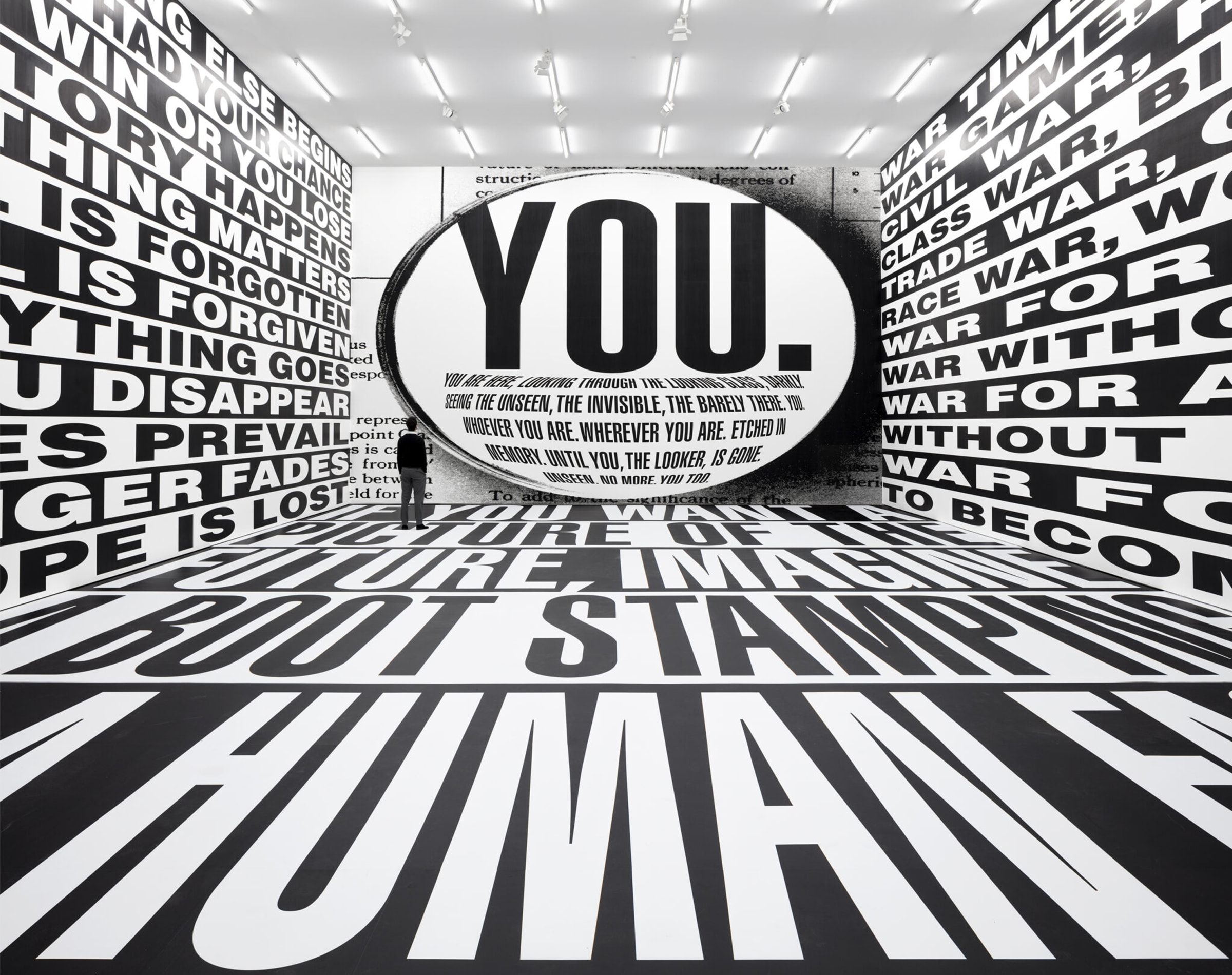
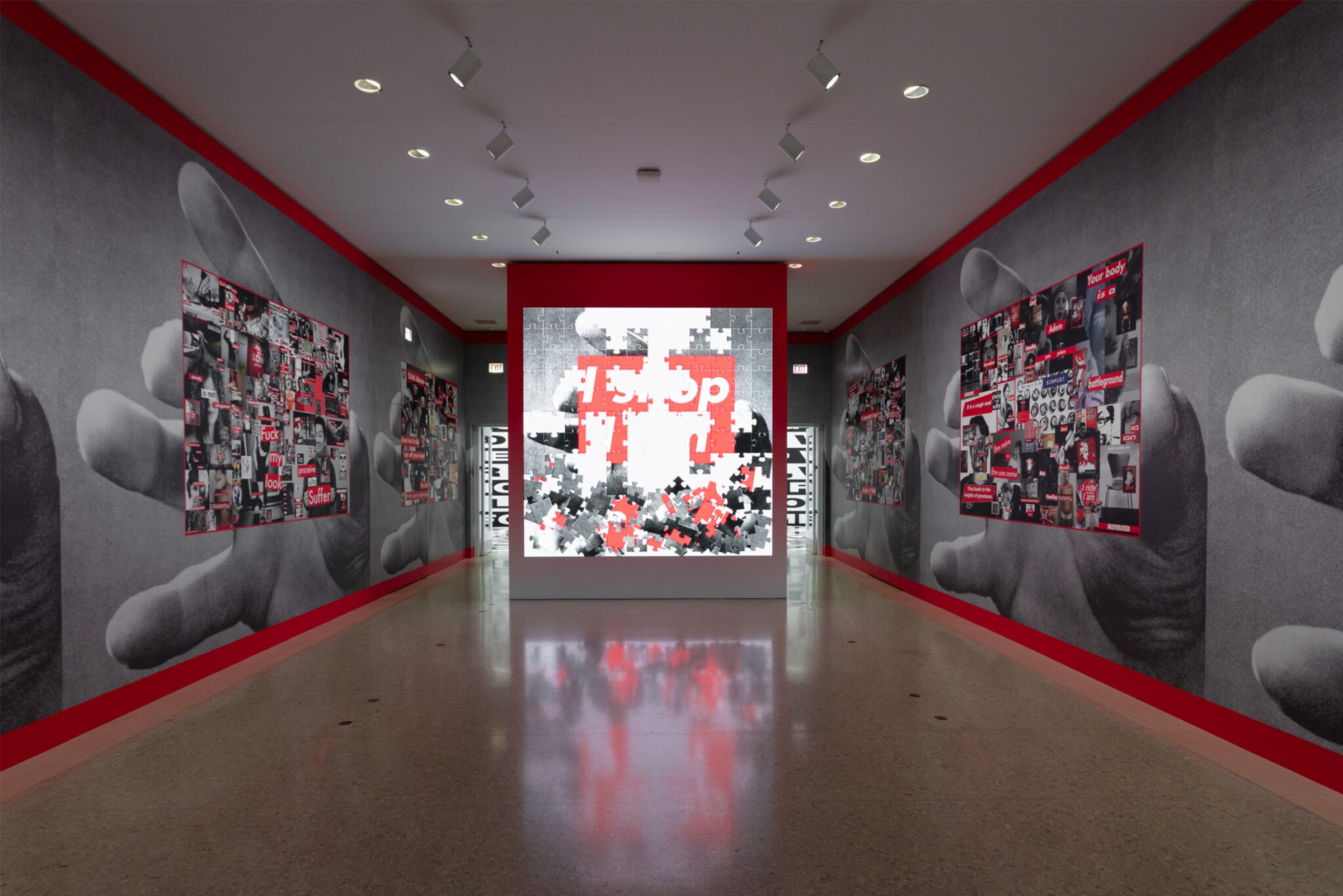
HUO: Your exhibition at Serpentine involves some early works which you’ve revisited. So, some of your most iconic works appear alongside new works, though it’s obviously not a retrospective, and not a chronological installation, but more like shows within the show.
BK: I really wanted the exhibition to look forward, look back, and be in the present. There are a lot of new text and video works in here that have to do with so many things happening today.
HUO: Can you tell me about the genesis of this exhibition?
BK: I truly never believed that people would really know my name or my work. It was, of course, very pleasing and gratifying, but also amusing to me that my work did gain this kind of presence. Amusing, because I have a very distanced and laboratorial view of how proper names become famous names, so the fact that certain works of mine became ‘iconic’ made me want to revisit the original meanings of those works and how they could be altered and re-thought. It’s very complex how so-called histories are made, who becomes visible and who is not visible, who is central and who is marginalized, who is major and who is minor – all the binaries, which I really disagree with. That was one of my concerns that I wanted to explore. Also, I’d been working with moving images and multichannel videos for 20 years and I really wanted to use the attributes of the moving image to inform that earlier work and change it.
Barbara Kruger is represented by Sprüth Magers (Berlin, London, Los Angeles, New York), and David Zwirner (New York, Hong Kong, London, Los Angeles, Paris).
Hans Ulrich Obrist is the Artistic Director of Serpentine, London, and Senior Advisor at LUMA Arles.
‘Barbara Kruger: Thinking of You. I Mean Me. I Mean You.’ is at Serpentine South, London, from February 1 to March 17, 2024.
This is an excerpt from a conversation commissioned by Serpentine and edited by Natalia Grabowska. Read the full interview in the free exhibition guide available at Serpentine, London.
Published on January 31, 2024.
Captions for full-bleed images: 1. Barbara Kruger, Untitled (No Comment), 2020. Intallation view. ‘Barbara Kruger: Thinking of You. I Mean Me. I Mean You.’ The Art Institute of Chicago, 2021–2022. Courtesy the artist and Sprüth Magers. Photo: The Art Institute of Chicago. 2. Barbara Kruger, Untitled (Remember me), 1988/2020 (stills). Courtesy the artist and Sprüth Magers.